

As the internet expands and develops, so does web design. Over the past decade, thanks to the smartphone boom, websites designed for desktops have moved to interfaces that adjust to both large desktop screens and small phone screens.
Flashback to mid-2000’s: Responsive design was rarely useful. Most people only used the internet from a desktop, so it didn’t matter if your website looked good on mobile devices.
Now that we’re approaching the 2020’s, a mobile friendly website is no longer an option – it’s a necessity. 81% of consumers research a business before making a purchase decision and 51% of that traffic comes from mobile devices such as Smartphones or Tablets.
What does it mean to be mobile first?
The Technical Difference
Non-responsive websites that are not mobile friendly are hard to use on phones. Words are too small to read and buttons are too small to click. It’s frustrating for users.
Responsive web design means elements within a website (images, forms, buttons, menu) will scale up or down and adjust their layout to function effectively on any screen size.
“Mobile first” is a term used to describe the design process behind modern responsive web design. In the past, websites were designed for desktops and made to respond well on phones. Now that over half of all web traffic comes from mobile devices, we are designing websites with the mobile view in mind FIRST and then ensuring that they respond equally well on desktops.
Here’s a visual example:
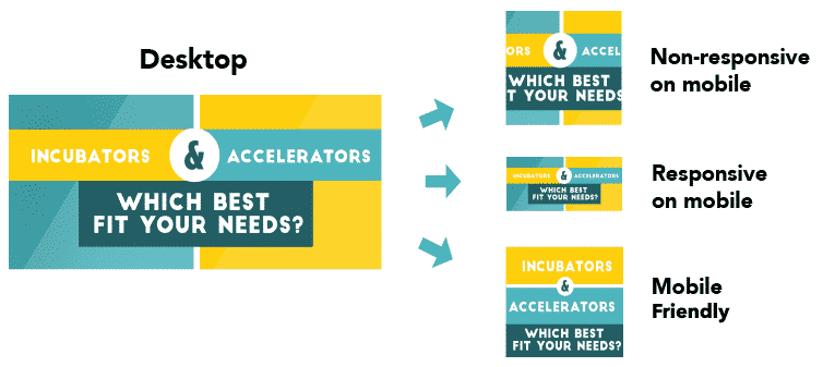
Images courtesy of FundingSage
Mobile friendly websites respond beautifully across all screen sizes and devices..
Rendering and Responsiveness
The example above was just used for a basic image, but imagine if you had complicated form to fill out or detailed menu on your website? If a site is not responsive, it’s not an easy task for your thumbs on a small screen.
Navigation is a major element of making your website mobile friendly. By optimizing the format for smaller screens, you’ve made the user experience much less frustrating and confusing. Elements such as “Hamburger” menus are a good example of optimizing the user experience while continuously conveying your most important information.
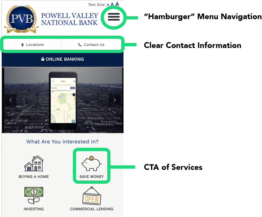
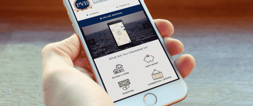
Powell Valley National Bank
Functionality
Other items that are optimized on mobile sites are the Call to Actions (CTA). To decrease bounce rates (when a user leaves the site after one page), it’s highly recommended to clearly display your business CTA almost immediately instead leading your audience with a wild goose chase to find what they’re looking for. Additional features such as Click to Call functions or Maps and Directions are vital for mobile first design.
Why does this matter?
In a world where the average attention span is less than that of a goldfish, it’s important to quickly and efficiently display the importance of your business from any device. In fact, 53% of visitors will leave a website that doesn’t load quickly or properly. By optimizing your website for mobile design, you’re not only increasing the downloading speed of the page itself but also enhancing the user experience. A better user experience translates to a successful businesses – a win / win for both parties.
If you’re concerned about the state of your website, contact us today.
Image examples pulled from Powell Valley National Bank, designed by Intellithought.