What Your Website Should Look Like in 2025
The Future of Web Design & Development In 2018, we correctly...
January 24, 2023


It comes as no surprise to anyone that your website needs to be responsive – meaning, it’s necessary for your website content to fit on any size screen.
We know that 81% of US consumers research online before making a purchase, and 56% of website traffic comes from mobile devices.
Further, Google gives priority to mobile-friendly sites which makes them more likely to show up in search results.

“Responsive” has led the market terminology for a long time. A responsive website is one that shrinks to fit the size of the screen it is being viewed on. Companies have long noted the need to work on different sized screens, but primal functionality is no longer acceptable.
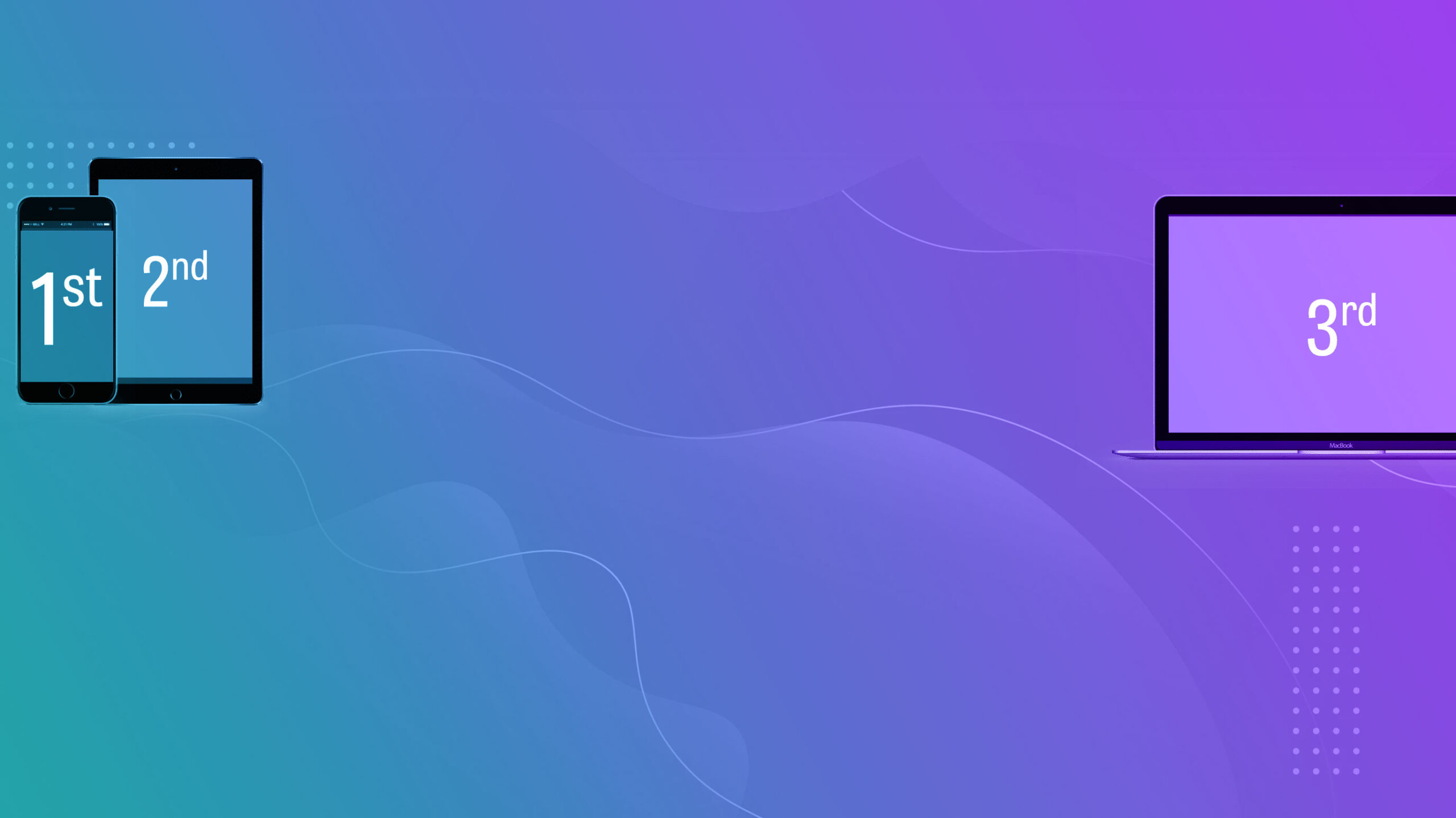
Across the board, mobile internet usage continues to steadily increase while desktop usage decreases. Over 50% of all traffic to our clients’ websites comes from mobile devices, so we’ve shifted design to FOCUS on the mobile experience FIRST. Mobile-first design takes your site beyond simply working on mobile devices to offer a truly tailored mobile experience.
Intellithought’s Mobile-First design incorporates elements like:
The Future of Web Design & Development In 2018, we correctly...
Intellithought worked with Christ Fellowship Church to build a site...
A website redesign is one of the most important aspects...